Fixing tru DREAM Packaging
For a recent study, we were tasked to go into the wild and find packaging that is not very engaging. The brand I chose to redesign is TRU, and the flavor I chose was the DREAM variant. My main issue with this package is that you can’t really tell what the product actually is. When I first saw it within a CVS, I noticed that I had no idea what it was. Is it soda? Coffee? Juice? I did not find out until googling the brand. Upon further research, I discovered this was a line of sparkling water with certain benefits, each title having a different effect. The DREAM variant claims to work as a sleeping agent. These had potential to be very fun products, but fell flat on the packaging. So, let’s fix it!

Once I had done my research of the product, we got to sketching. I wanted to keep the blue color scheme but add a little more visual interest to the can, and better highlight what the product is. I took some space and dream elements and really highlighted them on the can. With a lot of flowing lines, star elements, and clouds, these elements will better help explain the benefits of the drink- And will make it more enticing for people to grab and look at. In total, I created 5 can designs.

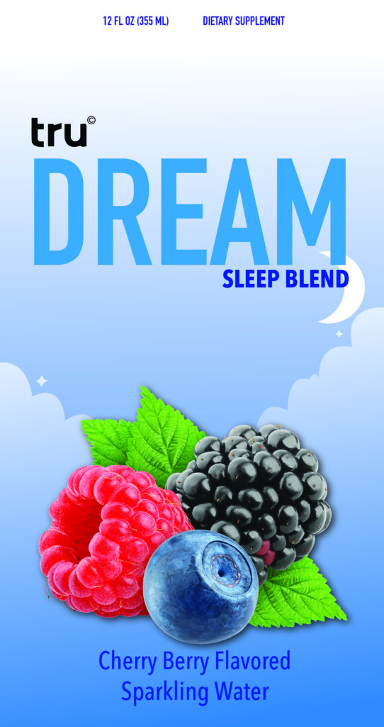
The 3rd and 4th concept ended up being the fan favorite among my peers, so I took these sketches to Adobe Illustrator. I began with a soft gradient background and added round clouds with a contrasting gradient. Then, I added a moon and a few little stars to help tie back to the “DREAM” title and sleeping elements. Finally, I wanted something to explain the flavor of the drink. I found some nice stock photos of a delicious bundle of berries and put it nice and large on the front, as well as the name of the flavor. Adding the title of sparkling water was important to me, too, since the original packaging did not specify this.
Though it isn’t shown on the mockup, the back of the can would go into more detail about the supplement and what its benefits are. The back of the real can is blank except for the nutrition label. You can view more about tru here at drinktru.com.
So, to fully show off the redesign, I placed this design on a mockup that gives us a beautiful final product! Comparing this to the starting product really helps show how much of a difference some color makes. I hope you enjoyed this short design exercise!


