The Rebranding of Brunch House
Our most recent case study was to rebrand a coffee shop with weak marketing. The User Experience relates to this in 2 ways: Firstly, real life. If a store if difficult to navigate due to lack of waypoints, it will greatly hinder the user experience. Secondly, online. The lack of social media presence and information can be bad for your user. So, I took these issues and focused on making the coffee shop all it can be. In this case study, you will come along with us on the journey of rebranding a little coffee house named Brunch House.
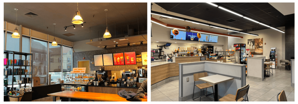
Our first step was to analyze our brand’s competitors- Big name fast food companies Dunkin’ Donuts and Starbucks. I chose 2 locations of each brand to visit and began to take note of their store. The waypoints, layout, affordances, nodes, and overall aesthetic were big things to consider. If they were all successful, it was important to note why and incorporate it into our own rebrand. However, if they were missing the mark, that was important as well in order to make sure we avoid these issues with our rebrands.
Starbucks
Target Audience
The target audience of this location was primarily teens and millennials. Inside the locations were groups of young adults conversing with their drinks. The primary audience is people who are looking for a drink and a snack while they sit down, and in most cases, to eat while they work.
General Vibe
The location is very dark and cozy, focusing on dark brown colors with minimal lighting and big pieces of art. It feels very quiet and casual as apposed to Dunkin’ who focuses more on in-and-out. This was the most similar to Brunch House’s vibe, so I kept this location in mind for our study.
Price & Quality
The products at Starbucks are pricier than Dunkin’, however their quality is also higher. The variety and quality of their food outdoes Dunkin’. However, they advertise their drinks more than their food, as it is their primary product- The snacks are simply affordances.
Dunkin’ Donuts
Target Audience
For Dunkin’ Donuts, the target audience is usually an older demographic, ones who are looking for primarily coffee. Someone who is looking for a quick drink to get in and get out, hence Dunkin’s priority on drive-throughs and not paying much attention to the vibe of their interior.
General Vibe
The vibe is simple, bright, and layout aimed at fast and efficient service. There is minimal seating in the location and while I was visiting, customers only came in the drive through and not in the store itself. Because of this, there are no waypoints in the store itself, which can be a hinderance.
Price & Quality
Dunkin’ focuses on more affordable products. They were advertising their 1$ sandwich deal on their LED screen. It is not super high quality, however, which makes sense for the price. Most customers are focused on coffee more than food, but they advertise their food quite a lot.
Selecting The Coffee Shop
The coffee shop I selected for this rebrand is a small shop named Brunch House in Prospect, Connecticut- My hometown. This location prioritizes itself on their coffee. While the aesthetic is comforting and they do offer high quality food, they lack waypoints and online presence. Their logo and overall branding were rather weak, and I knew I could work to improve this in my re-brand.
The location has no real affordances, so the team will work to develop some they could offer. View their FaceBook here.
The target audience of Brunch House is a millennial looking for an aesthetic location with good coffee and seasonal specials. The interior is very earthy, using plants and natural wood walls to create an industrial aesthetic feel. There is also a vine wall meant to be used for selfies and photos, fitting into the idea of a younger person being the target visitor. It is for someone who wants to sit down and have a good meal in a cozy location.
This rebrand will work to enhance the target user experience by making it easier to order food and understand the general vibe of the location. Not only will I do this in the physical location but will also improve the online presence. The end goal is to extend the reach of the Brunch House to a wider audience, offer better online services, and extend their affordances to a new wide range of products.
The main issues with this original logo:
- The font for the Brunch House is very kid-like and overall not a good fit.
- The kerning- Or space between letters- is weirdly off.
- The icon does not convey “restaurant”.
- Lack of strong visual interest.
Fixing The Logo
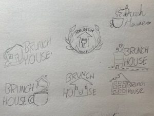
When designing my logos, I knew I wanted a simple type treatment mixed with an icon. The icon was a play on the words Brunch House to create a symbol- It was important to me that the icon could also stand on its own. The logo needed to have bold simple line work to match the type, which planned on being a bold sans serif. I had toyed with a script font but in the end, it didn’t match the general vibe of the establishment.
When I moved to illustrator, I decided to narrow it down to three main logos. The waffle house, smiling house, and cup house were cute in concept, but were too cartoony for the vibe of the store. I landed on 3 main ideas and began to expand upon them until I reached the final logo:

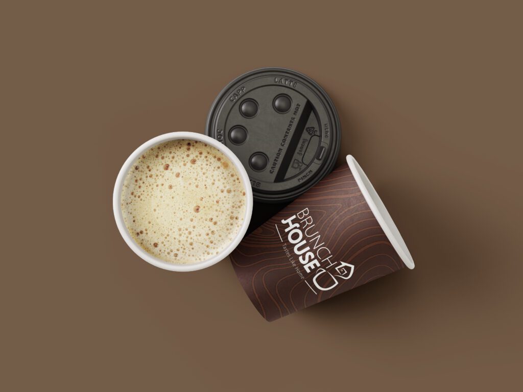
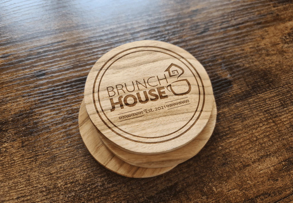
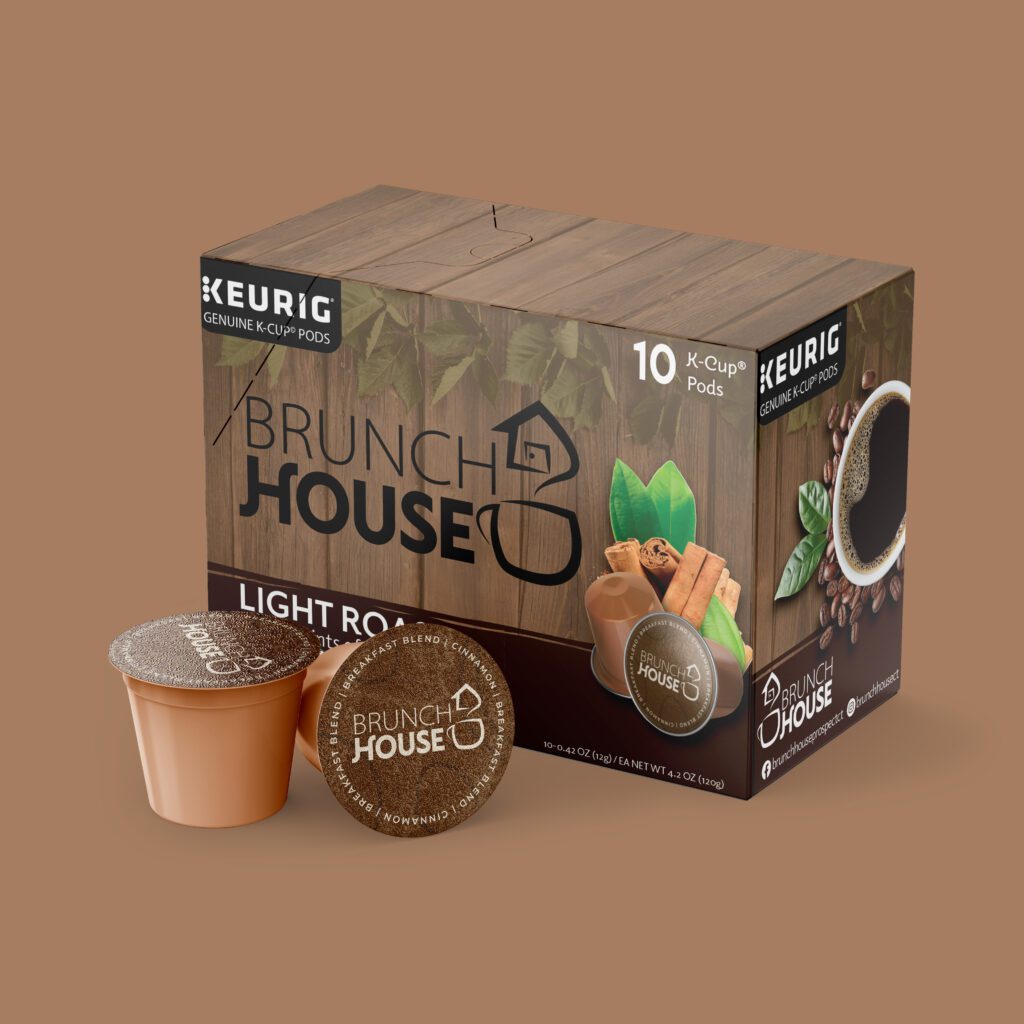
Finally, the last of the rebrand- designing physical affordances to better improve the brand experience. I wanted to base all of our mockups around their main product, their coffee. I designed some decorative coffee cups, wooden coasters, and a Keurig box. I wanted the box to match the interior, giving it a wooden texture with subtle nature elements and an earthy color palette. Below are some mockups of these affordances. We hope you enjoyed this dive into the rebrand of the Brunch House! (Click to view at full size!)
