Meet The New Band ‘The Converters’
Introduction
When you think of a rock band, what imagery comes to mind? Skulls, motorcycles, and crosses? Well, these are all true for the band The Converters. This was our final assignment for my final term in the Associates program. For this assignment, there were 2 important aspects. The first was to design a relevant logo for this 80’s garage band. As well, we would be creating different mockups for the band’s merchandise. So let’s rock n’ roll!
Research and Inspiration
I first began some target-demographic research with my peers. The first step was to understand the audience of The Converters. While it was clear they are a rock and roll band, it was important to research other bands to see what elements are successful. We gathered some imagery of rock, biker culture, and merchandise of other bands. As well, we each found photos of the audience in mind; 25-60 year old rock fans.

Sketching and Concept Development
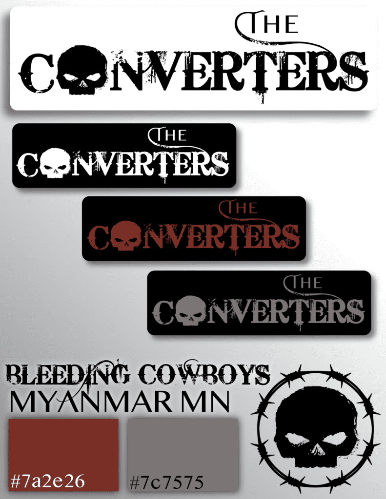
After some target demographic research, I began my sketching. While it would be hard to emulate in traditional drawing, I knew I wanted to utilize a heavy grunge texture font. I also wanted to use a strong symbol mixed into the typography that could be used as a stand-alone icon. My initial ideas for these symbols were lightning bolts, an eyeball, a skull, and a sword. Once these were moved to Adobe Illustrator, it was clear the skull was the big winner. My peers felt that the drip on the T was a bit long, but that was the only negative we could find. The skull and font choices were all deliberately chosen to match the biker theme of the band. Each little change was made to come to the perfect logo. So, with some slight editing, grunge texture and splatters, I reached a logo I was proud of.


Application of the Logo on Merchandise
The second part of this job was to design some “swag” for the band to sell at their shows. There were 5 main things to be created: A baseball cap, a t-shirt, a beer glass, a mug and a coaster. Using the research we had conducted earlier, I had a good understanding of the elements I wanted to include. I created the barbed wire circle as seen above as a symbol to be used within the merchandise. Black and grey will be the primary color scheme to fit with the logos. Each mockup took about an hour and a half to create; Each required their own proportions and assets to complete the look.
Though it was not required, I created 2 baseball caps. I wanted both a white version and a black version. I used the barbed wire motif to create a border for the cap, and the skull from the logo as a large icon in the back. For the t-shirt, I designed a world tour shirt. The logo is large on the front combined with a cross symbol. The back of the shirt features all the dates and locations from the tour, as well as the skull icon on the tag of the shirt. Both the cups use the same motifs, but in different ways. The beer glass uses the circle barbed wire and the skull icon. The coffee mug uses the skull, but instead has the barbed wire as a border on both the top and bottom edges of the mug. It also features The Converters’ song “Caffeine Concussion”. Finally, the coaster uses the same barbed wire circle and skull icon as the rest. However, per the band’s request, this coaster uses the band’s slogan “Not Bad For a Garage Band.” And this completes our merchandise!
Social Media Marketing
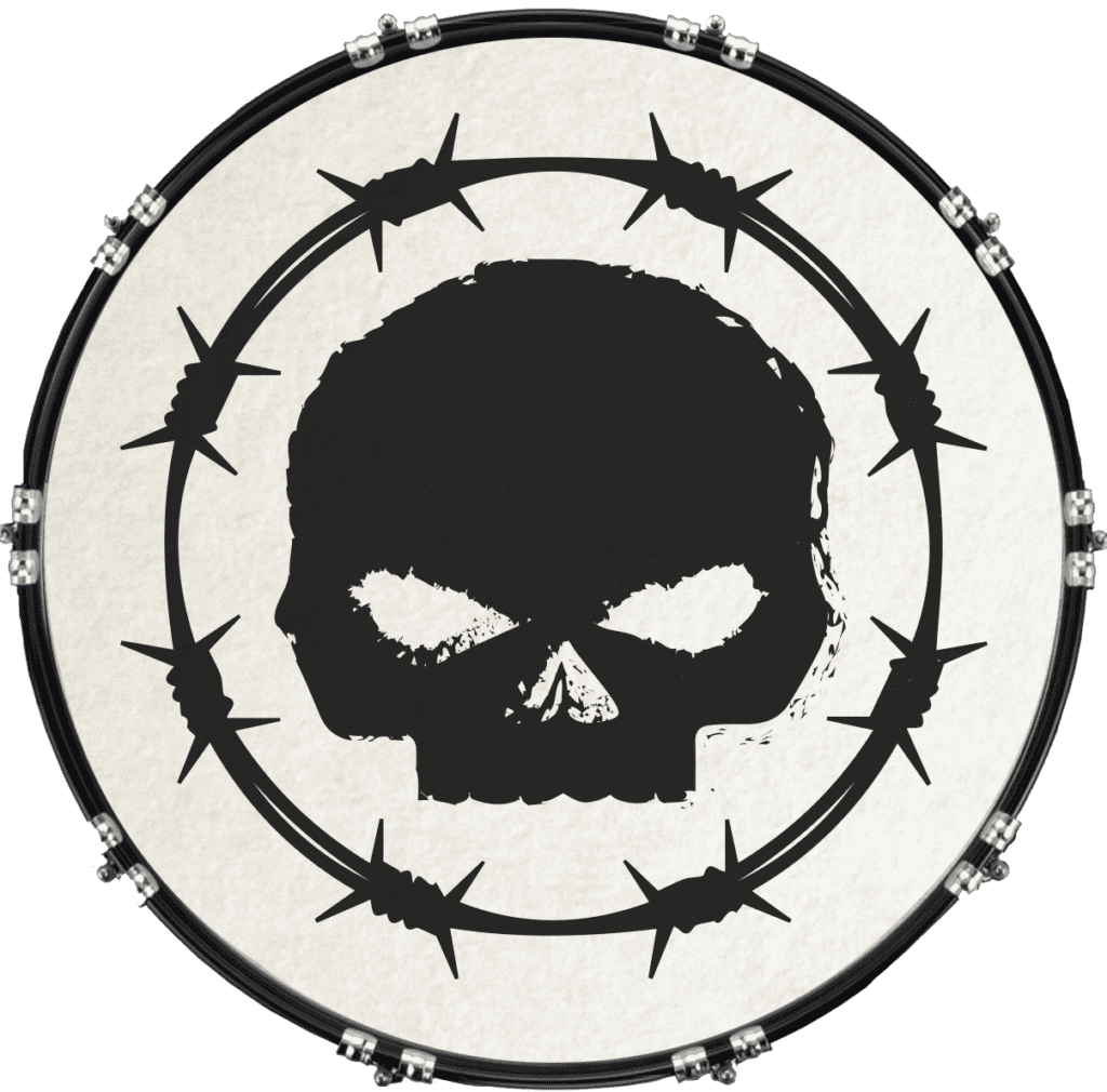
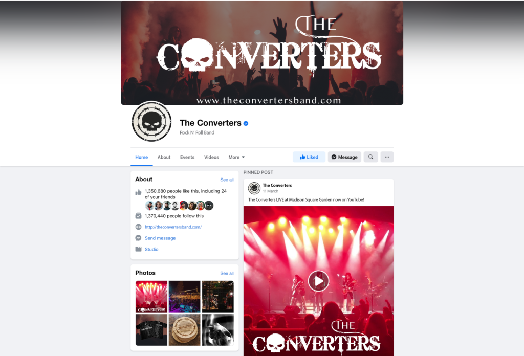
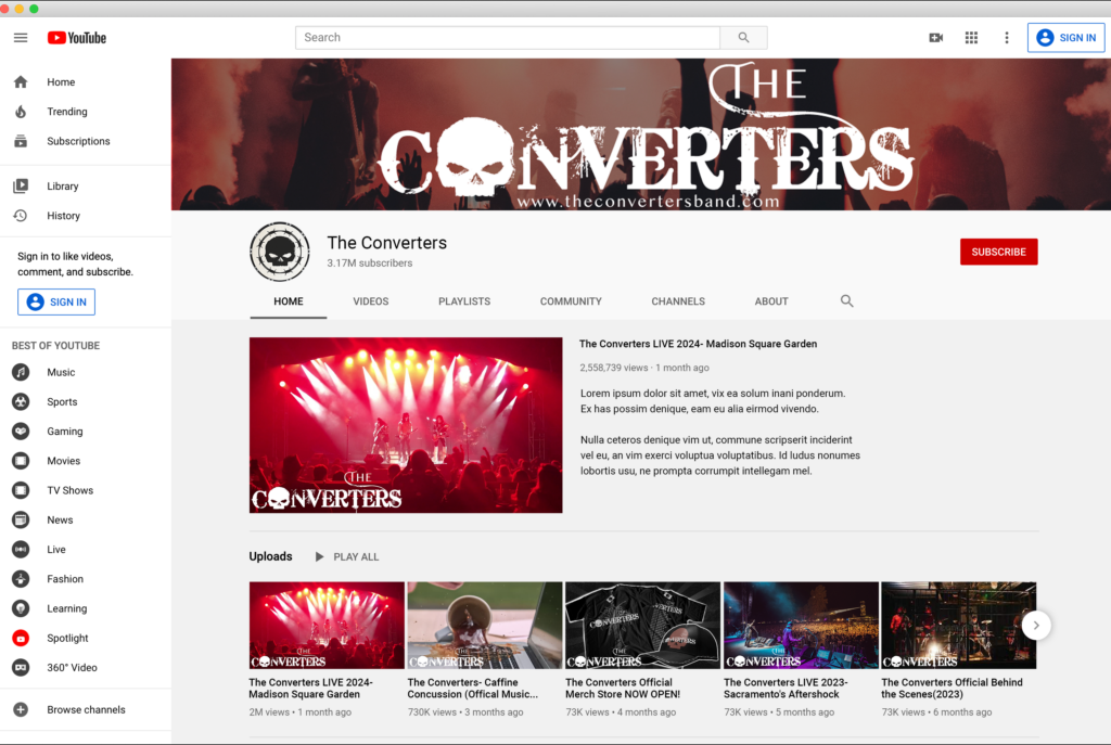
Finally, the last step of this branding mission was to create social profiles for the band. A social profile photo and banner were the goal, as well as mockups for a YouTube and Facebook account. These would help market the band and get the brand off the ground. Social media is the biggest marketing help in this current age, so this was an important step. The band requested the logo on a drum face as the social icon and a cheering crowd for the banner. I decided to reuse the barbed wire circle motif from the merchandise on the drum. I thought that using the full name of the band for the icon would get too small to read from afar, so I decided to just use the skull icon nice and large in the middle of the drum. Most bands have a simple logo to use and the skull provides a very simple but recognizable logo for The Converters.
Then, I moved to creating a mockup for their social pages. The banner is the first image shown in this case study! Click to view the images at full size!
Facebook Profile
YouTube Channel
The Final Summary- Conclusion
This project was all about iterative design. Learning how to discuss with peers to perfect your work is a big part of design. Being open to constructive criticism is everything in this field. While you may be hung up on an initial design, your viewers may not feel that way. Not only is it important to check with your fellow designers, but to always ask your client their opinions. Afterall, they are the ones you are designing for- It is important they are happy with your work. As well, I learned not to get too attached to my mockups. I began my mockups before I ran my logo by my peers; I was under the assumption that my mockups were final. Because of this, I had to go and redownload the PSD files I had forgotten to save. The bottom line: Never assume your first design is your final one.
